Client Application
The client application is per Django app. This is in order to reduce load time and memory usage. It means that:
You can’t access from application A to B on UI point of view;
You still can dynamically load what you need or bundle the other applications’ components;
What is loaded is only your bundled application’s views and components;
Oxylus uses the following frameworks: Vue (composition API), Vuetify, Pinia, Pinia-ORM. A client application is a javascript/typescript Vite project.
The basic project structure looks like this (from the app folder):
assets /
    package.json       # package information
    tsconfig.js
    vite.config.js     # vite project configuration
    src /              # source
        index.ts       # entry point: creates Vue application
        sfc.ts         # optional entry point: single file components
        models.ts      # pinia-orm models definition
        composables.ts # vue composables
        components /   # vue components
    tests /            # tests
    dist /             # bundles builts by vite
    node_modules /     # created when installing dependencies
The goal of the client application is to provide an interface to the end-user. This raises multiple requirements:
user interface:
this is handled by Vue and Vuetify;
integrated into Oxylus framework: this is the
@oxylus/oxlibraries;
manipulate objects from the backend:
modelize and handle data: using
pinia-ormbased modelssynchronization with the server through API: (
@pinia-orm/axiosin conjunction withrest_frameworkon the backend)
quality: tests integration
The Oxylus layer makes this integration, and provides for the assets a set of components and composables.
Note
Default configuration ensures that built files are put in dist directory.
The Oxylus’ static files finder looks up in this directory for the application’s bundled files.
Regarding dependencies declared by AppConfig’s assets, it looks up in the
node_module folder.
Application Layout
The client application provide the following layout using OxApp component. The screenshot is of a model panel (OxOrganisationTypePanel, the view is table).
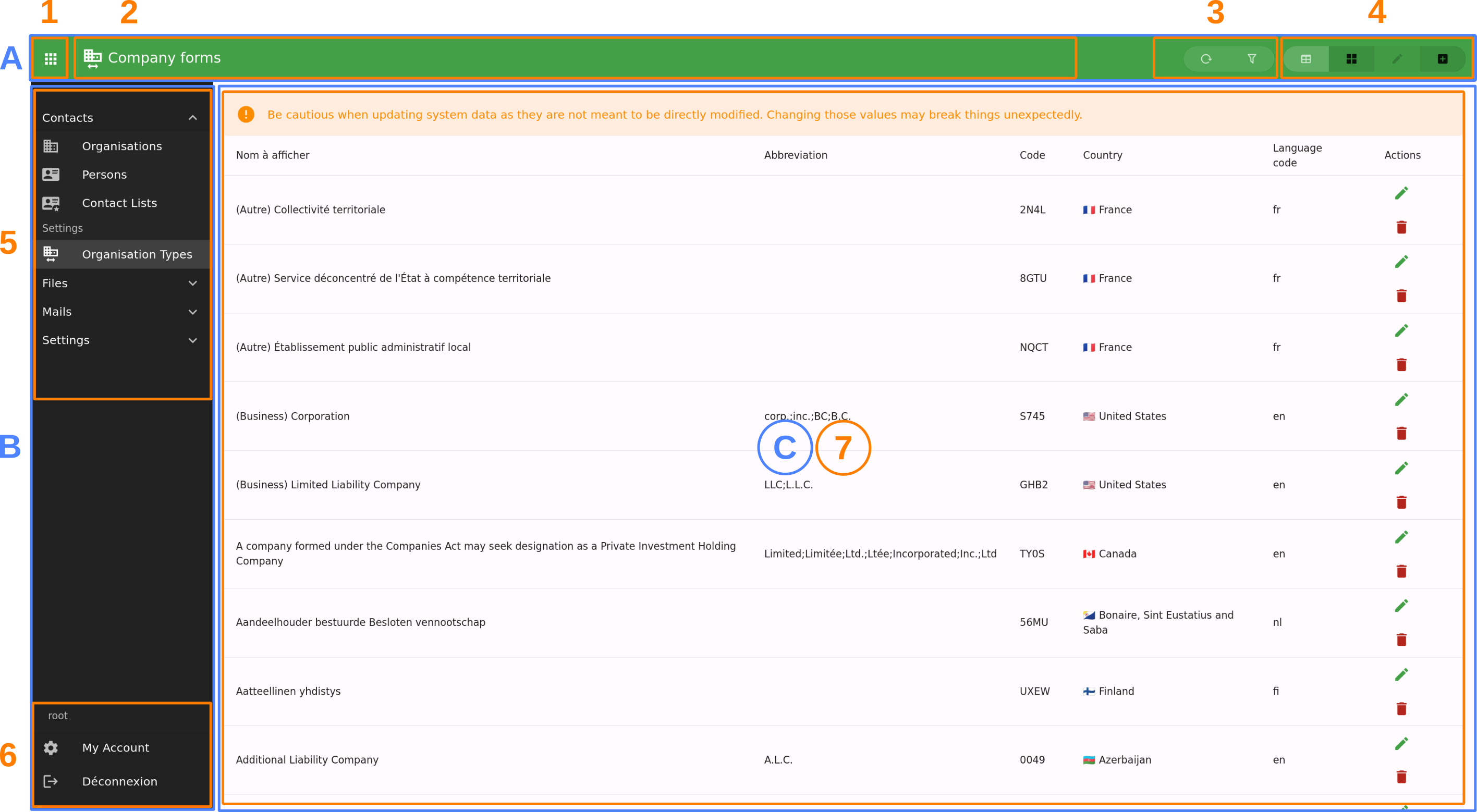
A: top bar, providing quick access and navigation;
B: applications menu (which can be hidden by button [1]);
C: all panels displaying only the current one. A panel can provide multiple views [7];
1: button to show/hide applications menu;
2: panel or view’s title and icon;
3: view’s actions;
4: panel’s views navigation buttons;
5: applications navigation (reflect the structure provided by
panels.py);6: user menu;
7: panel’s content or views;
A view can have multiple sections, in such case they will be displayed under tabs:

Panel and view title and navigations will be rendered in the top bar. A view can also provide extra actions and buttons there, such as showing list filters. Note: filters are available for all list views, while the list itself is handled by the model panel component.
Panels can have a provided state which will be rendered when required (such as processing API request, or error display).
This provides us the following components:
OxApp: the main application components under everything is done (and providing users, navigation, application data, etc.)OxPanel: the base panel component, handling views routing, an nested views layout;OxModelPanel: panel for displaying a model, fetching data, and providing a default set of views (table list, card list, edit and create);OxView: a single view;OxSection: sections in a view;OxModelEdit: interface for editing a model instance, handling saving and state management;
Setup
For a basic application providing model views, you’ll have to write at least:
a project setup configured;
models mapping to data returned by your application viewsets;
composables: at least to use the model you’ve declared;
components for each model:
panel: this is the main interface for accessing and editing a model;
editor: this is used for editing and viewing an object (or a new one);
locales: specific localisation messages;
Configuration
You’ll need at least the @oxylus/ox npm package that provides all core elements to make it run. Some other: @oxylus/mails, @oxylus/tasks, etc.
Ensure to configure your package.json, tsconfig.json and typedoc.json.
Regarding, we already provide a vite.config.js as template:
import baseConfig from '../ox/src/vite.config.base'

export default baseConfig
For more customizations, use vite’s mergeConfig method:
import { defineConfig, mergeConfig } from 'vite'
import baseConfig from '../ox/src/vite.config.base'


export default mergeConfig(
    baseConfig,
    defineConfig({
        build: {
            rollupOptions: {
                input: {
                    // example: add an entry point for SFC.
                    // see How-to's section for more info about SFC
                    sfc: 'src/sfc.ts'
                }
            }
        },
    })
)
Entry point & App
Default configuration uses src/index.ts as entry point of the application – aka:
this is the module being loaded for initializing the application.
import {init, createPinia} from '@oxylus/ox'
import {App as OxApp} from '@oxylus/ox/components'
import * as components from './components'

// Vue Application
const App = {
    extends: OxApp,
    components,
}

// Initialize pinia
const pinia = createPinia()
init({App, plugins: [pinia] })
Few explanations about what’s going on here:
OxApp: this is the default Vue application component;init: initialize Vue, Vuetify and mount the app to default entrypoint. It also runs various setups as for translations.createPinia: initialize Pinia-ORM with Oxylus specific customizations (such as include authentication models used for permissions, etc.)
Models
Models are stored in models.ts. We use a custom version on pinia-orm’s models.
Please refer to Pinia ORM’s documentation for more info.
In assets/src/models.ts:
import { models } from '@oxylus/ox'


export class Book extends models.Model {
    static entity = "books"

    // The junction between Django and Vue/Pinia-ORM
    static meta = new models.Meta({
        app: "my_app",      // Django app name
        model: "book",      // Django model name (as in label)
        url: "my_app/book/",// API entry point to model's viewset
        title: "title"      // Specify a field or func to use as verbose_name
    })

    static fields() {
        id: this.attr(null),       // will be object's uuid
        author: this.string(""),   // uuid to related author
        title: this.string(""),
        summary: this.string(""),
        published: this.string(""),

        $author: this.belongsTo(Author, 'authors') // Related author's object
    }
}

export class Author extends models.Model {
    static entity = "authors"
    static meta = new models.Meta({
        app: "my_app",
        model: "book",
        url: "my_app/book/",
        title: (obj) => `${obj.first_name} ${obj.last_name}`
    })
    // ...
}
Providing meta attributes allows the different utility classes to make the junction with Django, such as get API entry points.
You also need to add composable to allow usage of the models’ repositories. In composables.ts:
import {useModels, t} from '@oxylus/ox'
import * as models from './models'

/** Use our models. */
export function useMyAppModels() : Object {
    return useModels([...models])
}

// You can also add field validation rules used by Vuetify here.
User Interface
Panels
The client interface is composed of multiple panels, one per use-case or model. Panels are provided by applications and can be sub-divised into multiple views. The base component for panels is OxPanel, which is extendable by its slots.
As an example, a common case is to provide CRUD for models, which is what does OxModelPanel: it provides views for listing (with search and filtering facilities), edition and creation.
Panels and nested views are named, and accessible through their path. A panel has a default view falling back to list.tables when none is provided (it can be configured through component’s attribute view).
Here is a simple example of a panel:
<ox-panel name="login" :title="Login" :icon="mdi-account">
    <template #append-title>
        <!-- this goes in the top bar at the right -->
    </template>
    <template #default>
        <!-- this goes in the main content -->
        <ox-login/>
    </template>
</ox-panel>
Lets apply it to our own example. We will prefix our components with Ma.
components/MaBookPanel.vue:
<template>
    <ox-model-panel v-bind="props" :repo="repos.files">
        <!-- forward slots provided by parent node -->
        <template v-for="name in forwardSlots" :key="name" #[name]="bind">
            <slot :name="name" v-bind="bind"/>
        </template>

        <!--
            [Optional] Put custom filters here.

            Filters are used for list rendering. They map to actual `django-filter`
            fields of a `filterset`.
        -->
        <template #list.filters="{list,filters, owner}">
            <slot name="list.filters" :list="list" :filters="filters"/>
            <!-- Example of input field, just remember to add `hide-details` -->
            <ox-field v-model="filters.year__eq" type="number"
                label="t('fields.published')"
                hide-details />
        </template>

        <!-- Override how an item's field will be rendered -->
        <template #item.author="{item}">
            {{ item.$author.first_name }} {{ item.$author.last_name }}
        </template>

        <!--
            You should provide an editor which will be used for view/edit an item.
            This is actually put inside the edit views' default OxSection.

            `saved`: this method is called when the user saves the item;
            `value`: initial item's values.
        -->

        <template #views.edit.default="{value, saved, ...bind}">
            <ma-book-edit :initial="value" :saved="saved" />
            <slot name="views.edit.default" v-bind="bind" :value="value" :saved="saved"/>
        </template>

        <!-- If you want to add extra sections, you can add them here: -->
        <template #views.edit="{value, saved, ...bind}">
            <ox-section :name="test" :title="t('app.test.title')">
                <!-- do something here -->
            </ox-section>
            <slot name="views.edit" v-bind="bind" :value="value" :saved="saved"
        </template>

        <!-- The create view -->
        <template #views.create.default="{value, saved, ...bind}">
            <ma-book-edit :initial="value" :saved="saved" />
            <slot name="views.create.default" v-bind="bind" :value="value" :saved="saved"/>
        </template>
    </ox-model-panel>
</template>
<!-- We use typescript! -->
<script setup lang="ts">
import { ref, reactive, useSlots, withDefaults } from 'vue'

// This is used to provide model panel properties
import type {IModelPanelProps} from '@oxylus/ox'

// `t` is used for translations
import { t } from '@oxylus/ox'
import {OxModelPanel, OxField} from '@oxylus/ox/components'

import MaBookEdit from './MaBookEdit.vue'
import {useMyAppModels} from '../composables'

const slots = useSlots()

// Filter out slots you are actually overriding. If None, you can avoid the use of forwardSlots and
// adapt template's code.
const forwardSlots = Object.keys(slots).filter(x => !(['list.filters', 'top', 'item.actions'].includes(x)))

// Use our models
const repos = useMyAppModels()

// Then declare component props
const props = withDefaults(defineProps<IModelPanelProps>(), {
    // Set to model's entity
    name: 'books',
    // When you need relations in the list, add it here: they will be loaded as the list is loaded
    relations: ['$author'],
    // List of fields to be rendered in the list views
    headers: ['name', 'published', 'author'],
})
</script>
What does happens here?
Property
headers: this list fields to be rendered by list views (table, card, etc.).Slots with name prefixed
item.will be used to render fields by list views.Other slots will be nested under the
OxModelPanelcomponents, allowing for extensibility. You may want to filter some properly, for examplelist.filters.The
editview is provided for viewing/creating/updating a single item. In this view, you will provide the component used for edition (see next section). Note that when user only has view right, the nested form will be disabled.
Note
Regarding user permissions, using the attributes provided by model.meta, the different components will
automatically check for user allowances. For example, if user has right to view but not edit an object,
on the edit view, all items are rendered as non-editable fields.
Editor
As you might have seen, we also need to declare an MaBookEdit component. This one is used to render the form for edition/view.
In components/MaBookEdit.vue:
<template>
    <ox-model-edit ref="model-editor" v-bind="attrs" :repo="repos.books">
        <template #default="{editor}">
            <ox-field :editor="editor" name="title" required/>
            <ox-field :editor="editor" name="published" type="number" required/>
            <ox-field :editor="editor" name="summary" required/>

            <!-- Use autocompletion for the author -->
            <ox-autocomplete :repo="repos.author" lookup="search"
                item-value="id" item-title="$title"
                v-model="editor.value.author"/>
        </template>
    </ox-model-edit>
</template>
<script setup lang="ts">
import { useAttrs } from 'vue'
import {OxModelEdit, OxField, OxAutoComplete} from '@oxylus/ox/components'

import {useMyAppModels} from '../composables'

const repos = useMyAppModels()

// we just forward all attribute to inner OxModelEdit
const attrs = useAttrs()
</script>
Views
A panel may contains multiple views. In such case, navigation buttons are displayed in the top bar. Views can provide actions shown next to it.
Views are put in a different slot each named as views.[name]. The [name] will be used as view name (which is used in paths).
OxModelPanel provides default set of actions based on this name, for thoses starting with list. and detail.. Note that the prefix is included as view name, such as list.table for slot views.list.table.
Actions
Actions are buttons that can execute a specific behaviour. It checks user’s permission in order to execute, and can display in two different ways: as select list item, or as a button. This actually depends on the context: they are displayed in list views (usually as button, eg. in list view, a button a list row), and in detail view (in a select menu).
The OxAction component handles the following:
User permission check (including object permission when required);
Running an action, eventually asking user for confirmation;
Can be used as link;
Can be rendered as
v-list-itemorv-btn;
There are different places where you might want to put action, so lets split it down in different use cases:
Provide an action from the model panel component: directly add the action into the model panel’s template for
item.actions;An external application want to provide the action to another app’s model panel: in such case you’ll extends and override the django template for model panel;
Extend another application’s model panel
The model panel declared in panels.py (ox.core.panels.Panel) specifies
a template, defaulting to ox/core/components/model_panel.html.
This is the template to extend to add your custom action, views or components.
Lets just take a quick look at templates inclusion chart:
ox/core/app.html: includesmodel_panel.htmlfor each panel declared in app’spanels.py;ox/core/components/model_panel.html: uses providedpanel(asox.core.panels.Panel) to render the actual panel.
Add an action
The model_panel.html template have a custom block for actions. Look at the original
code if this file:
<template #item.actions="bind">
    {% block actions %}
    <ox-action-model-delete v-bind="bind"></ox-action-model-delete>
    {% endblock %}
</template>
By now you should know what to do for extending: override the template. Eventually,
you can use panel.name for conditional rendering (when extending default model_panel.html).
Don’t forget to provide bind to the action! This ensure the action will be correctly rendered and is used for the right item.
Add a custom view
To add a custom view or component, you should integrate it using SFC. This is done in
the panels block, as:
{% block panels %}
{{ block.super }}

<ox-view name="my-component-view" title="{% translate "My Component" %}">
    <ox-component src="{% static "myapp/MyComponent.js" />
</ox-view>
{% endblock %}
See Single File Components and async loading for more information on Single File Components.
Monorepo setup
You may take example on the Oxylus’ setup for this one. Few notes:
Symbolic link from the package to the app’s
assets, eg.ox/apps/contacts/assets => assets/packages/contacts.